With the majority of initial interactions between businesses occurring online, some might question the value of business cards and how important it is to have them at all. Technological solutions are slowly replacing traditional paper and board and yet, business cards still seem to have an important role to play, especially at events, where following verbal interest in your products or services, a card is still the popular choice for keeping in contact.
If your potential customer is intent on reaching out to you then it doesn't really matter if your card is premium or not. Good use of typography and layout will help the relevant details to be easily read. However, if your potential customer is undecided on yours or another company, then small details and quality can help create a lasting impression even after the memory of the initial meeting fades. Our philosophy on business cards is this: if you apply good format and type, a simple card will often suffice, but if you have a business that is premium or specialist then matching your quality and design is worth the effort. Here we have selected some essential points worth thinking about in order to create a memorable and effective business card.
Size and shape
The typical size of a business card is 85 x 55 mm (3.35 × 2.17 inches). Using this standard size means it will be identifiable as a business card, fit in any wallets or card holders and is tried and tested for good layouts. On the other hand, you can stand out by opting for customised sizes or shapes with die cutting, although as with all customisation this will increase costs. Negative space within a card can help to create a clever and unique design - made more or less useful depending on your content, or if you decide not to go beyond a traditional look, simply round the corners for a less formal aesthetic.

Orientation is worth considering too – in some cases you might benefit from a vertical card - this often depends on the nature of your business and the amount and type of information you want to present - long names, email and web addresses will work much better on a landscape card. For example if any of these elements are longer than 20 characters, it might be difficult to place them on a vertical business card without making the font size significantly smaller than the standard 7-8 pt.
Material and texture
While paper/board is the most popular material to print a business card on, you may choose something less conventional, for instance laser engraving on wood, steel, or plastic/acrylic. These materials can differentiate your card from those of your competitors and increase the card’s durability and the chances that your potential client will decide to keep it.
Even if your card is printed on paper, you might want to think about how it feels in your hand. It can be smooth or rough, matte or glossy, ribbed or flat. The thickness of the card is important too - thinner versions might be suitable if you have a need to print a large number of cards to distribute at an event and have no choice but to stay within a set budget, whereas during an important meeting you will probably choose to present a better quality card.
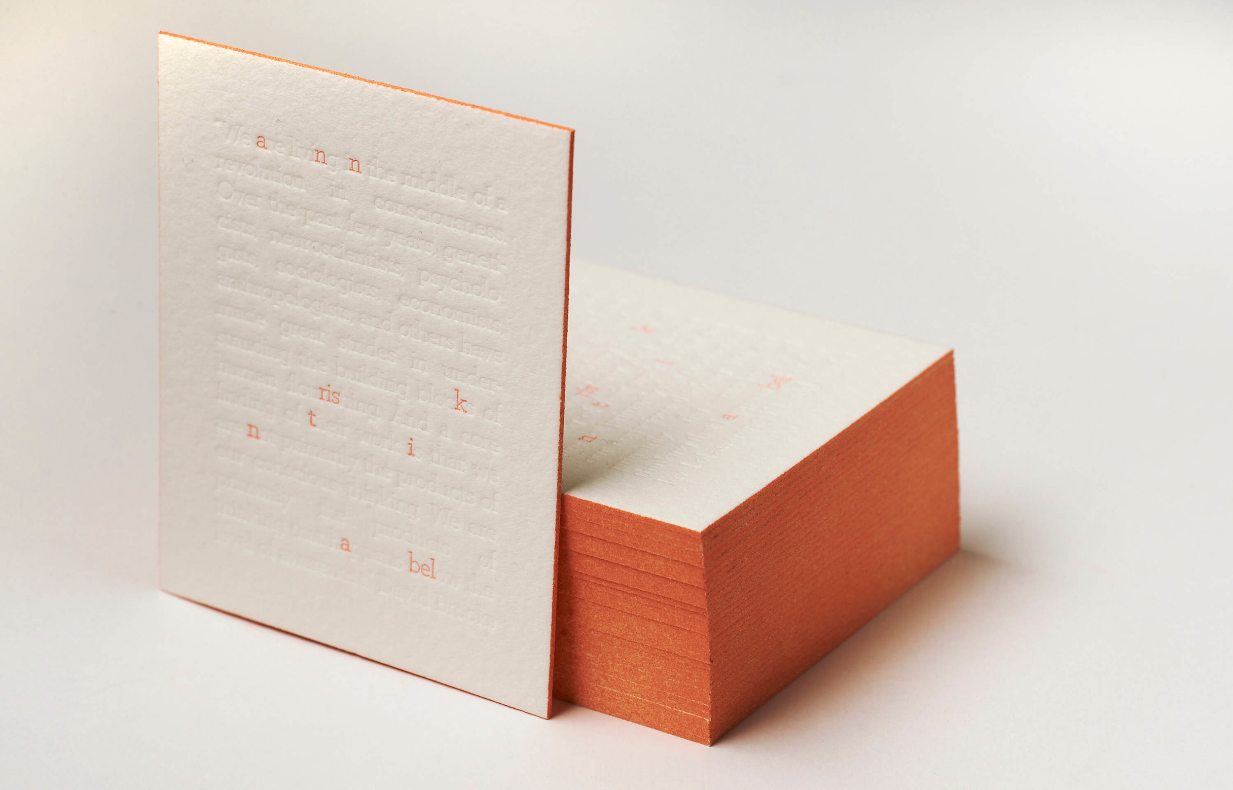
Letterpress cards with logos and patterns can serve both aesthetic and informative purposes - special effects like foil blocking work very well for certain industries but add a lot of cost. Although high quality letterpress business cards will be more costly than their simpler counterparts, you might find this to be a worthy investment as they will undoubtedly produce a good impression on your clients.
We recommend this company for very cost effective and high quality letterpress printing:
http://typoretum.co.uk/letterpress_business_cards/
Profession matters
A business card can serve as a vivid reminder of what you do without a word about your services – make use of shapes, textures and visual elements that relate to your profession or industry to create a memorable and clever representation of your company. You can use virtually any object associated with your business as long as it is relevant and serves your purpose of improving a client’s first impression of what you do.
Colour
When you aim to create professional looking business cards, the choice of colours plays a great role. Whereas the particular colours you use will often be dictated by your existing brand guidelines (unless you are creating a new brand), always make sure that colour combinations on the card work together. Whether you prefer a riot of colour or a minimalistic black and white design, stay in the colour scheme that prevails throughout your website, logo, catalogues, etc. Cohesive brand elements maintain a reliable image of your company.
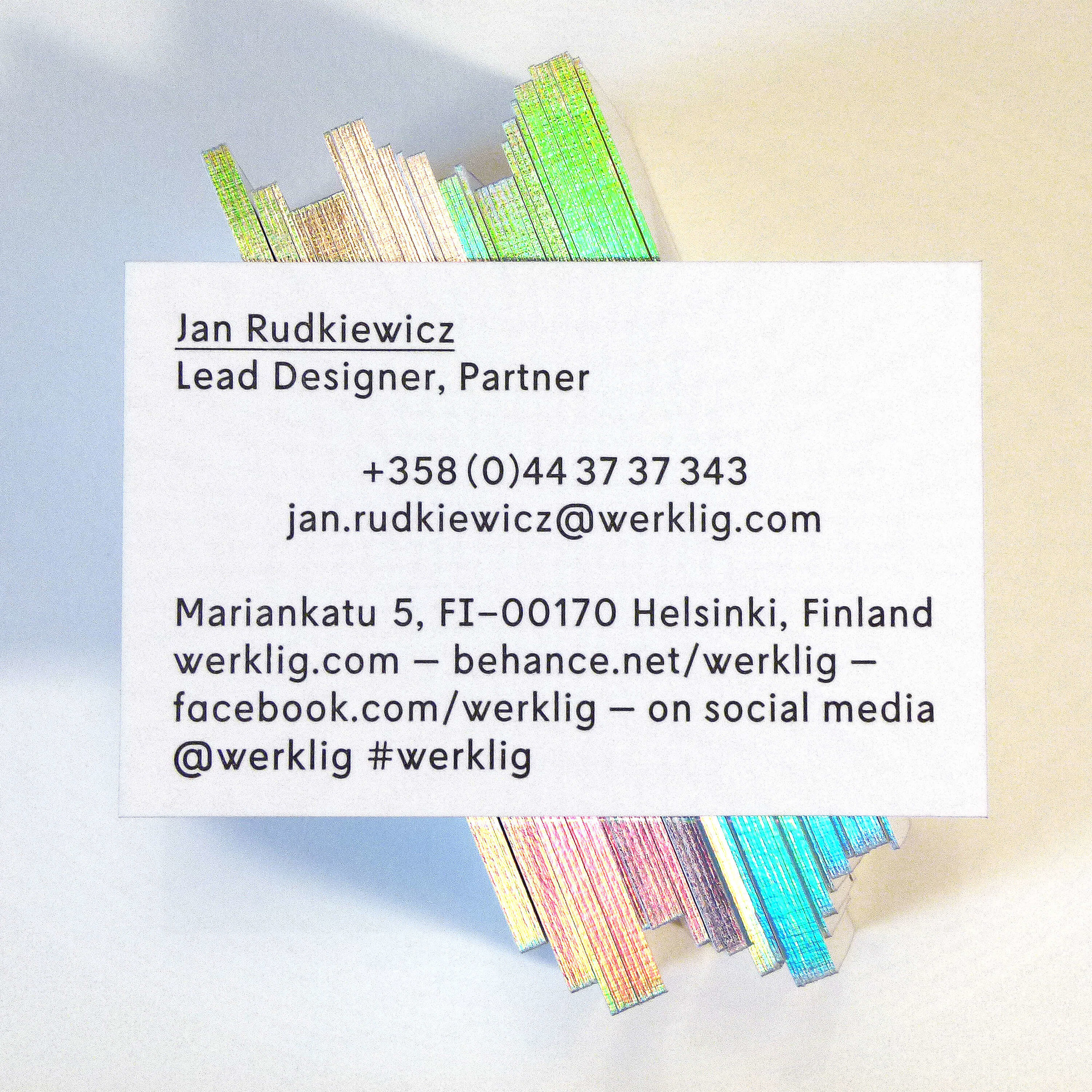
Information to include
The list of contact details to be put on the back of a business card generally includes a company and contact person’s name, phone number, e-mail and work address, but you are free to add as many details as required depending on what information is considered to be the most significant. If your social media accounts can be of use to your clients, it is worth mentioning them as well.
With all kinds of stationery, the best design solution will always depend on a number of factors, such as the type of products or services you offer, your goals, business values, USPs, background and more. However, you can always resort to a simple yet professional design for a quick solution - check out these free editable business card mockups we have created for you to test out your details. To use them simply download and open using Adobe Acrobat or a similar modern pdf reader, then you can click on the text to type in your details. Any questions please email us.