How to keep your brand consistent

Any brand comprises both visual elements, such as logo marks, colour schemes, fonts, etc., and the impressions that people have when they hear or see these visual elements. The latter may sometimes depend on personal emotional experiences rather than the actual brand elements, but nevertheless on a larger scale consumers’ brand associations are the crucial part of brand formation. Everything that influences perceptions of your business becomes a part of its identity.

Brand consistency means that all the facets of your brand, from logo design, product packaging through to social media profiles convey the same message in the same tone of voice. This allows you to build a strong brand identity and gives people something to remember your company by. Brand consistency also means that all visual elements of your brand are in line with each other – for example, if you choose to use modern typography and minimalist style for your website, you probably want to ensure all your marketing materials follow that style and leave ornate fonts and complex layouts for other projects.

If a brand sends conflicting or incoherent messages it can turn away consumers or make it more difficult for you to attract the target audience. In contrast, consistent brand messaging and values will help you gain the trust of your customers and form a positive attitude to your brand.

In this blog post we will give you some tips on how to achieve and maintain brand consistency within your company and across your marketing channels.


Create and maintain your visual identity

According to psychologists, most people are Visuals, which means that they perceive and memorise visual information better than any other form. You can benefit from this fact by developing a consistent visual identity. It includes all the observable elements of your organisation, such as your logo, colour palette, fonts, images, etc.

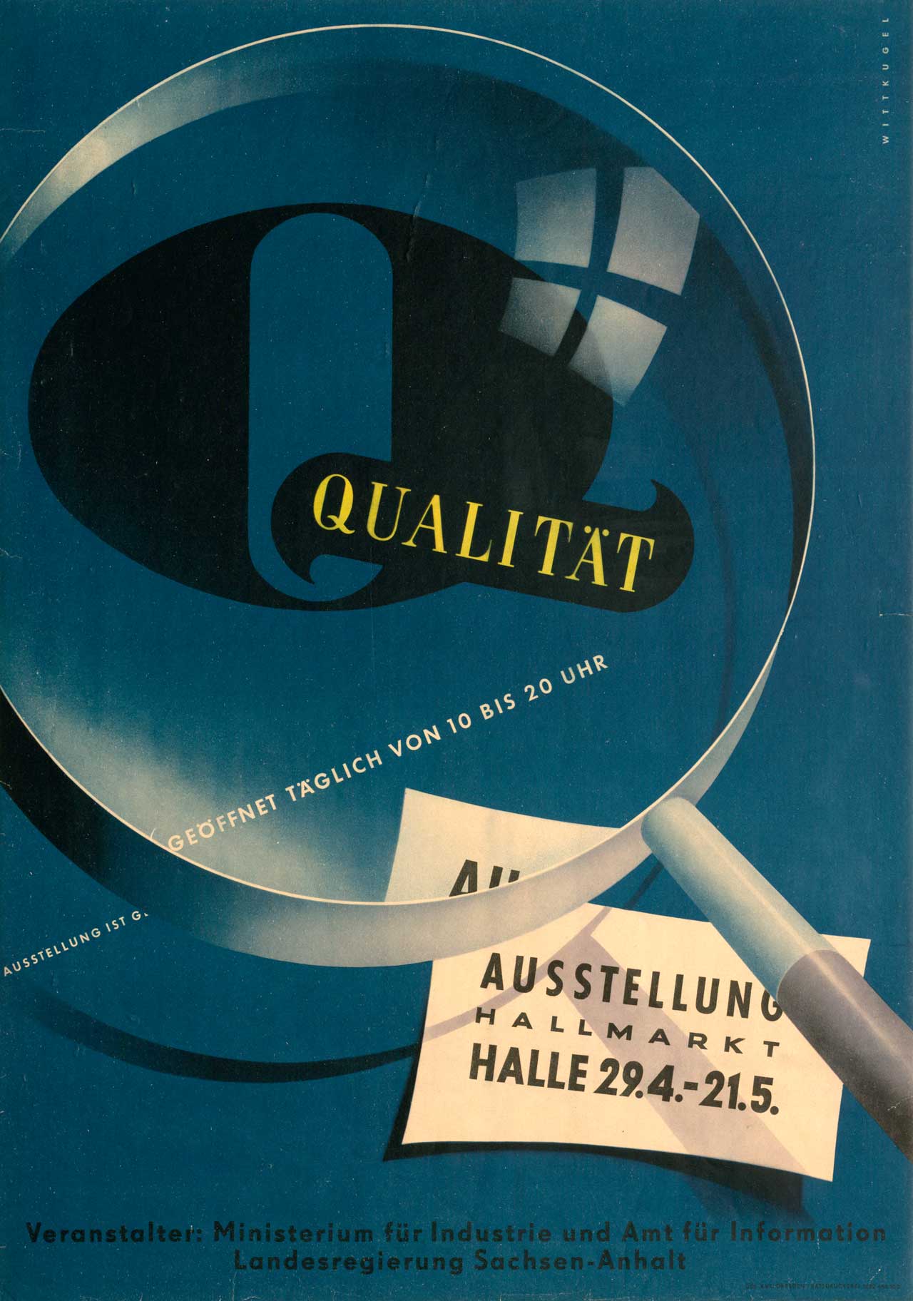
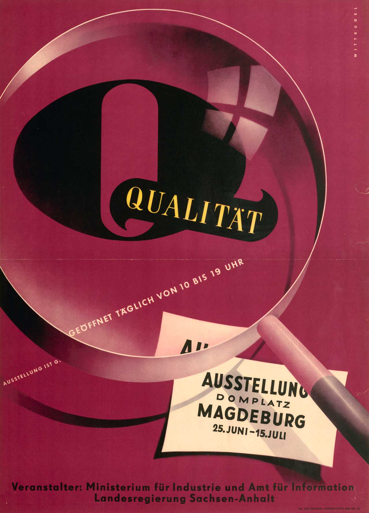
When the visual components of your brand are determined, you want to stick with them. Think of McDonalds – if you suddenly saw their logo in blue or if the Golden Arches looked different, you would probably still recognise the company, but it would leave you confused and possibly that confusion could lead to business being lost for McDonalds.

Adhere to your brand colours, fonts and graphics throughout your website, social media accounts, email marketing campaigns, and other digital or printed promotional materials. The more consistent you stay in your visual strategy, the more memorable your company will be.


Develop a Brand Guide

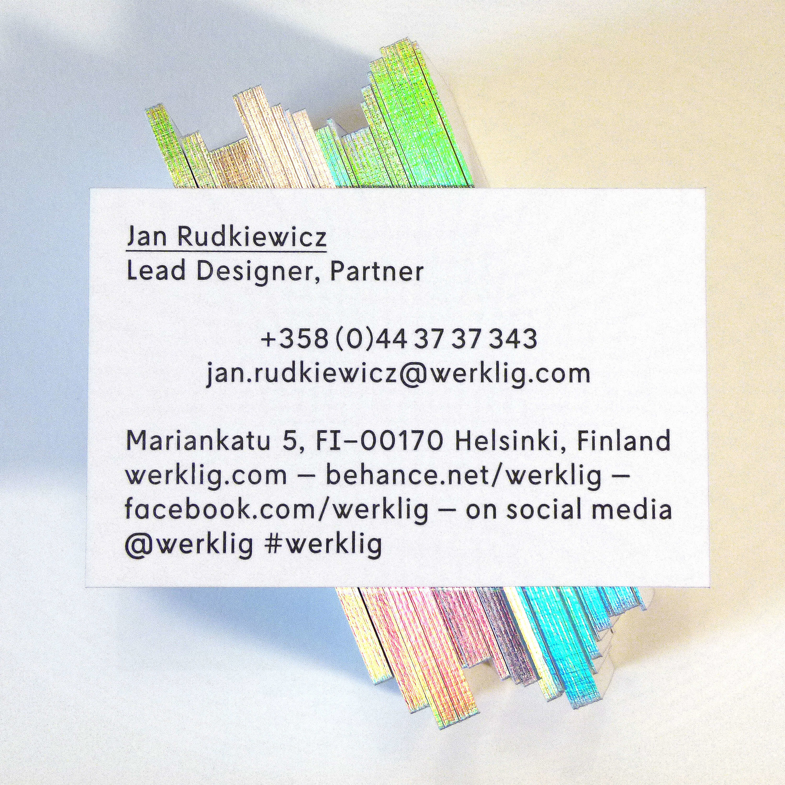
A brand guide is a set of rules that determine the use of your company’s logo, colours, fonts, imagery and other core elements of your brand. Think of it as a set of instructions that you can refer to whenever necessary. For example, among other things a brand guide will probably include a list of your company colours with the respective hex values, so every time you need to use a certain colour you can refer to the guide and choose the desired hex value which will guarantee that the colour is the correct one (this should also include RGB and CMYK values for designers).

It’s up to you to decide how detailed you want your brand guide to be, as long as you are confident that you have covered all the important aspects, and that the final result will serve as a useful tool for the business.

A brand guide can be used by all your employees and even external contractors (for example if you want to order branded promotional products). It gives clear directions on proper application of your brand elements in various contexts, from a print advertisement to a business letter. Make sure it is simple, to the point and full of visual examples.


Stay consistent online

Have you ever encountered a business social media page that didn't resemble the normal style of the company? Or have you come across a mobile site that looked completely different from its desktop counterpart?

In order to make your brand easily recognisable online, it is vital to be consistent throughout all of your online channels. Make sure that your website and social media accounts use similar visual and written content and promote the same messages. The same principle applies if you have business profiles on several social networks - all of them should communicate the same brand identity. If it's loud and fun on Twitter, your brand should have a similar look and feel on Facebook and Instagram too.


Choose content in line with your brand values

If you have a blog on your site or a channel on YouTube, the topics you select for your posts and videos should coincide with your brand’s mission and goals. Choose subjects that will be useful for your customers and stimulate their interest to the product or service that you offer. Some social media 'experts' claim that selling via social is not the way to go, but we believe that if products are shown in a useful and genuine context they are often welcome. 

The way you write or speak is also important. If your Instagram account shows romantic photos and inspiring quotes, a blog post with a different tone of voice can be an unpleasant surprise for your readers. Try to adhere to a uniform style throughout all channels of communication with your clients. For this you may want to add notes on the brand tone of voice in your brand guide.


support your brand mission

Everyone in your organisation, no matter what position they hold, should have a clear idea of your brand’s mission and values and consider them each and every time they interact with a customer.

All departments within your business should be representative of your brand. An HR manager, for example, should be able to explain to new employees why your brand is unique and what it promises to the clients. Sales and marketing specialists should understand how to convey your brand’s concepts through content and visuals. Make sure there are no misconceptions about your brand among your team as this may negatively affect your business strategy.


Remember who you really are

In the pursuit of competitors or trends, do not get distracted from your brand’s core focus. If you would like to explore a new social media platform, for example, first ask yourself whether a brand like yours would be expected on this platform or whether your existing or potential customers would use it.

Similarly, a decision to launch a playful and funny ad campaign for your classic and conservative brand may run the risk of your company being misunderstood by its target audience. The solution is simple: stick to your brand’s character to ensure consistency and success.

Designing a business card

With the majority of initial interactions between businesses occurring online, some might question the value of business cards and how important it is to have them at all. Technological solutions are slowly replacing traditional paper and board and yet, business cards still seem to have an important role to play, especially at events, where following verbal interest in your products or services, a card is still the popular choice for keeping in contact.

If your potential customer is intent on reaching out to you then it doesn't really matter if your card is premium or not. Good use of typography and layout will help the relevant details to be easily read. However, if your potential customer is undecided on yours or another company, then small details and quality can help create a lasting impression even after the memory of the initial meeting fades. Our philosophy on business cards is this: if you apply good format and type, a simple card will often suffice, but if you have a business that is premium or specialist then matching your quality and design is worth the effort. Here we have selected some essential points worth thinking about in order to create a memorable and effective business card.

Size and shape

The typical size of a business card is 85 x 55 mm (3.35 × 2.17 inches). Using this standard size means it will be identifiable as a business card, fit in any wallets or card holders and is tried and tested for good layouts. On the other hand, you can stand out by opting for customised sizes or shapes with die cutting, although as with all customisation this will increase costs. Negative space within a card can help to create a clever and unique design - made more or less useful depending on your content, or if you decide not to go beyond a traditional look, simply round the corners for a less formal aesthetic.


Orientation is worth considering too – in some cases you might benefit from a vertical card - this often depends on the nature of your business and the amount and type of information you want to present - long names, email and web addresses will work much better on a landscape card. For example if any of these elements are longer than 20 characters, it might be difficult to place them on a vertical business card without making the font size significantly smaller than the standard 7-8 pt.

Material and texture

While paper/board is the most popular material to print a business card on, you may choose something less conventional, for instance laser engraving on wood, steel, or plastic/acrylic. These materials can differentiate your card from those of your competitors and increase the card’s durability and the chances that your potential client will decide to keep it. 

Even if your card is printed on paper, you might want to think about how it feels in your hand. It can be smooth or rough, matte or glossy, ribbed or flat. The thickness of the card is important too - thinner versions might be suitable if you have a need to print a large number of cards to distribute at an event and have no choice but to stay within a set budget, whereas during an important meeting you will probably choose to present a better quality card.


Letterpress cards with logos and patterns can serve both aesthetic and informative purposes - special effects like foil blocking work very well for certain industries but add a lot of cost. Although high quality letterpress business cards will be more costly than their simpler counterparts, you might find this to be a worthy investment as they will undoubtedly produce a good impression on your clients. 

We recommend this company for very cost effective and high quality letterpress printing:

http://typoretum.co.uk/letterpress_business_cards/

Profession matters

A business card can serve as a vivid reminder of what you do without a word about your services – make use of shapes, textures and visual elements that relate to your profession or industry to create a memorable and clever representation of your company. You can use virtually any object associated with your business as long as it is relevant and serves your purpose of improving a client’s first impression of what you do.

Colour

When you aim to create professional looking business cards, the choice of colours plays a great role. Whereas the particular colours you use will often be dictated by your existing brand guidelines (unless you are creating a new brand), always make sure that colour combinations on the card work together. Whether you prefer a riot of colour or a minimalistic black and white design, stay in the colour scheme that prevails throughout your website, logo, catalogues, etc. Cohesive brand elements maintain a reliable image of your company. 


Information to include

The list of contact details to be put on the back of a business card generally includes a company and contact person’s name, phone number, e-mail and work address, but you are free to add as many details as required depending on what information is considered to be the most significant. If your social media accounts can be of use to your clients, it is worth mentioning them as well.

With all kinds of stationery, the best design solution will always depend on a number of factors, such as the type of products or services you offer, your goals, business values, USPs, background and more. However, you can always resort to a simple yet professional design for a quick solution - check out these free editable business card mockups we have created for you to test out your details. To use them simply download and open using Adobe Acrobat or a similar modern pdf reader, then you can click on the text to type in your details. Any questions please email us.


Best ideas for growing your e-commerce site

It takes more than offering great products to get people to actually buy them. A number of factors can get in the way of e-commerce growth, tough competition and low customer awareness being some of the biggest. On the positive side, when you know exactly what you should keep in mind and do in order to increase your sales, it’s just a question of making it happen. 

For this blog post we’ve reviewed some of the popular recommendations for growing e-commerce business and combined them with our own knowledge and years of digital marketing experience. Whether you are a start-up or an operating business, these ideas might shed some light on what to do if your sales are not as high as you would like them to be.

Evaluate your traffic

How many people visit your site every day? This is the first question you should answer to get an idea of why you have as many or as little sales as you do. Latest research on retail conversion rates found that only 3-4% of your site visitors will actually buy something.  If the average amount of visitors to your site per day is somewhere around 20-50 people or less, you know that you simply do not have enough views to expect a large number of sales. 
Once evaluated, think about how you can attract more visitors. Social media, back links, publicity, advertising, etc. – choose any, or test how each of these channels affect your traffic and stick with the ones that work for a longer period. 

Understand your market

Take your time to think about what kind of audience you are targeting because this will help you decide on the best marketing strategy. For example, if you are selling women’s clothes, remember that the majority of Pinterest users are female, with fashion being one of the most popular Pinterest topics. 2015 stats showed that 53% of pinners made a purchase online after seeing a product on Pinterest. Instead of investing your time and efforts into marketing your products on each and every channel, be smart and do your research first to find the channel that can get you ahead. It is also important to know how many potential customers you can have. You might want to check out social media activity of some of the most successful competitors to get an idea of what is achievable.

Embrace social media

A huge amount of traffic to your site can be driven from social media pages. Remember that Instagram is a great marketing tool not only for visual industries. Even if you aren’t selling something that has a great visual impact, as long as your page is interesting and useful you will always find your fans. Post pictures of how your products are made or create some tips for your customers, and most importantly – engage with your followers to show them that you truly care. 

Think of user experience

Make sure your website makes the shopping experience easy and enjoyable. Try to think of yourself as a customer browsing through your store. Are product images good enough to give a clear idea of what you are buying? Is there a detailed description for each item? What is the delivery cost and return policy? Is it easy to navigate through the site on various devices? These are just some questions to start with.

Be attentive

When you focus on reaching out to new customers, do not forget about the existing ones. Every time someone makes a purchase, treat them with care. This is especially easy to do when you are a start-up and do not yet have a large number of orders. Try packaging inserts – it can be anything from a product sample to a small relevant present. If your service exceeds customer expectations, they are more likely to buy from you again, recommend you to their friends and share their experience on social media.

These are just a few general thoughts on growing your e-commerce business. Good SEO and monitoring Google Analytics will make an even bigger difference. The best strategy, however, will always depend on your industry, the specific products you sell, your USP, business values, etc. We would be happy to help

EAST Germany’s Most Famous Graphic Designer

In 1951 Klaus Wittkugel was head designer for the German Democratic Republic’s Office of Information, his famous Five Year Plan poster highlighted the GDR’s Soviet-style economic goals ahead of an exhibition it advertised. After the event ended—a local newspaper of note ran a piece condemning Wittkugel’s work: “An abstract, intellectual play with numbers and format takes precedence over depictions of people and clear symbols… This ever-dominant formalist approach to visual communication continues to find its expression in other experiments that show a hatred of mankind.”

Over the years, Wittkugel designed some of the most recognisable work from the Soviet era. But after his censure at the hands of the 'hatred of mankind' label, Wittkugel’s work began to embrace the human form over his more typical Modernist use of typography. One famous poster shows a young coal miner emerging from the darkness, his face covered in soot, the words “Ich bin Bergmann! Wer ist mehr? (Translation: “I am a miner! Who is better?”) written below him as a call to action. 

On the whole, Wittkugel’s designs were more playful than you might guess for someone who worked for Stalinist East Germany.


Using Cinemagraphs in content marketing

Cinemagraphs are still photographs in which a minor and repeated movement occurs. Published in either animated GIF format or as video, they give the illusion that the viewer is watching a video. However, as many stunning cinemagraphs across the internet show, the creativity in how those single elements are chosen and exploited is what makes them so interesting and watchable.


Produced by taking a series of photographs or a video recording, and, using image editing software, compositing the photographs or the video frames into a seamless loop of sequential frames such that motion in part of the subject between exposures (for example, a person's dangling leg) is perceived as a repeating or continued motion, in contrast with the stillness of the rest of the image.

The term "cinemagraph" was coined by U.S. photographers Kevin Burg and Jamie Beck, who used the technique to animate their fashion and news photographs beginning in early 2011.

In December 2014, the United States Trademark and Patents Office awarded the trademark for the term "cinemagraph" to Flixel Photos, Inc., a Canadian software manufacturer.

So why and how can they be used in content marketing? In 2015 Instagram /Facebook introduced new video formats for their respective platforms. Of course Facebook has for a long time been able to post videos, but the new addition was 7 second profile videos and with Instagram, 15 second post videos. Cinemagraphs are effective in these kind of social media spots because of the looping nature of the static post or profile picture. To play a video can look great, but hair blowing in the wind on a profile picture made as a cinemagraph arguably does more to impress.

Whatever your business or niche, a cinemagraph can add a bit of cool to your social channels, by picking out the specific element that will catch the eye and surprise, mesmerise or interest your viewers. There is also something quite satisfactorily artistic and personal about the way they are made.

Some great examples can be seen here:

http://giphy.com/search/cinemagraph